Integrating ArcGIS into Power BI Dashboards for Enhanced Data Visualization
This project improved geospatial reporting in Power BI by integrating ArcGIS into a dashboard used to analyze fueling behavior and related costs. Standard Power BI maps were not sufficient for the level of geographic analysis required, particularly when stakeholders wanted clearer spatial context and stronger decision support.
The analysis centered on Arlington County’s post-COVID shift in fueling behavior. Before COVID, county vehicles were expected to refuel at designated on-site stations. During the pandemic, those routines changed, and staff began using off-site fueling options more frequently. The goal was to understand how those shifts affected fuel consumption patterns and cost.
Data preparation
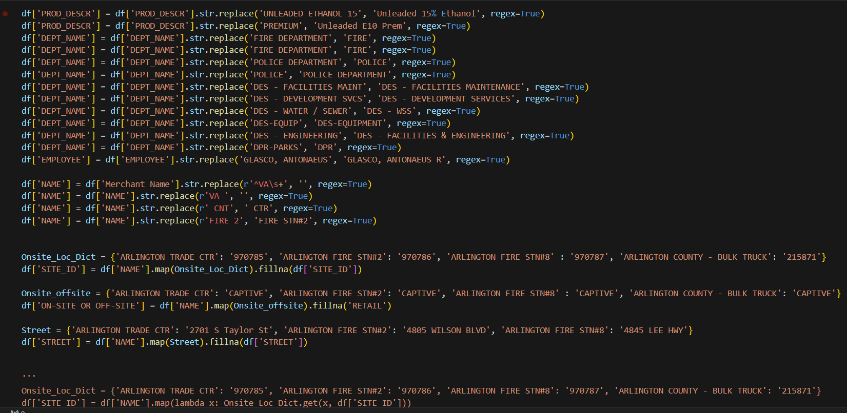
The project combined data transformation, geocoding, and dashboard design. A major portion of the effort involved reconciling vendor data discrepancies across years, especially after changes in the underlying vendor and collection methods. Python transformations were used to normalize the data before integrating it with historical records in Azure SQL Server.
Geospatial workflow
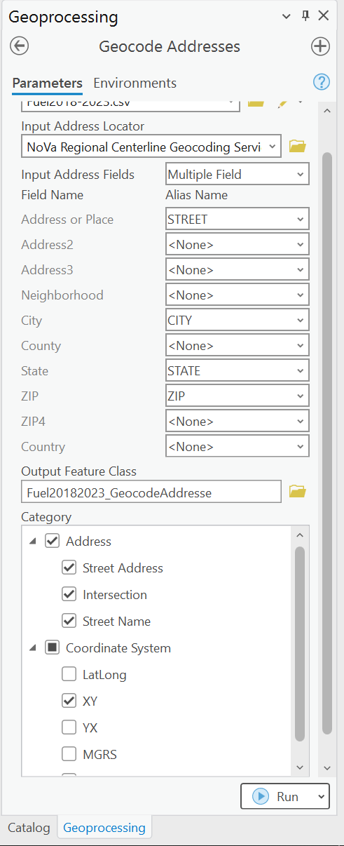
An early attempt to geocode addresses directly inside Power BI through Bing Maps could not be deployed reliably through the Power BI service. The solution was to shift geospatial processing to ArcGIS Pro and work with the GIS team to produce more robust map-based analysis.
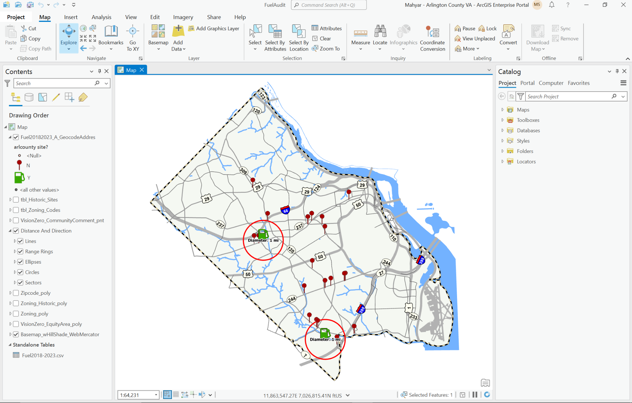
The ArcGIS workflow supported one-mile-radius analysis around on-site locations, giving stakeholders better context for understanding when vehicles were refueled off-site and how those decisions affected cost and operations.
Outcome
This project is a good example of combining business intelligence and GIS to answer an operational question with stronger visual evidence. The result was not just a dashboard, but a more defensible way to understand behavior, cost differences, and location-based patterns.